ShopDreamUp AI ArtDreamUp
Deviation Actions


Suggested Deviants


Suggested Collections


You Might Like…


Featured in Groups


Description
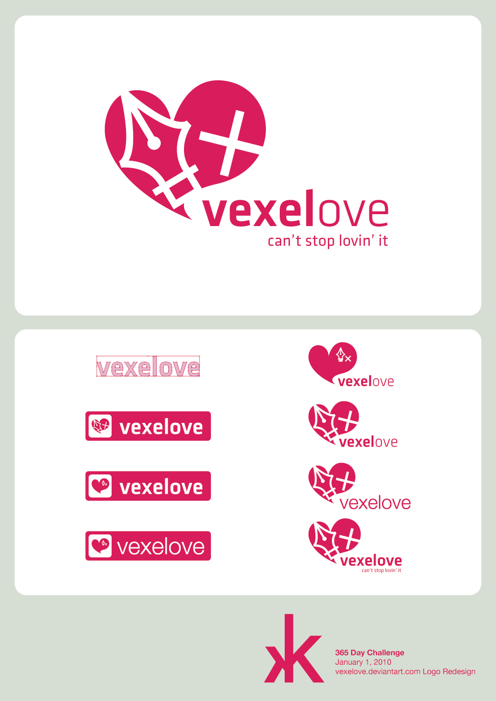
January 1's entry is finally here for my #YearOfDesign challenge! (Unfortunately someone occupied themselves too much yesterday with a vector to get something finished for my January 1, so instead, I'm going on Jessie's time. lol)
This one is for vexelove's logo redesign. There weren't really any specs, so I figured I could just go with whatever comes to mind.
So the things that did come to mind about vexels are that in the name, it's vexel love, so hearts definitely work (plus in the old logo, a heart was used on a cube), but also, the pen tool is the weapon of choice. In addition to that, deviantART now has a sparkly new font by the name of Klavika, so after playing around with that for a while, I decided to use that as well.
My pick of the logos is the big one at the top, but you can see the other variations at the bottom. What do you think? Did I choose the right one?
This can also be found on my tumblr account [link] where you will find my daily submissions - only the really good ones will end up on dA")
I'll have another one up soon for the 2nd. This time it'll be a journal design for these guys - I'm not sure that they'll need one, but you can never get enough practice!
This one is for vexelove's logo redesign. There weren't really any specs, so I figured I could just go with whatever comes to mind.
So the things that did come to mind about vexels are that in the name, it's vexel love, so hearts definitely work (plus in the old logo, a heart was used on a cube), but also, the pen tool is the weapon of choice. In addition to that, deviantART now has a sparkly new font by the name of Klavika, so after playing around with that for a while, I decided to use that as well.
My pick of the logos is the big one at the top, but you can see the other variations at the bottom. What do you think? Did I choose the right one?
This can also be found on my tumblr account [link] where you will find my daily submissions - only the really good ones will end up on dA
I'll have another one up soon for the 2nd. This time it'll be a journal design for these guys - I'm not sure that they'll need one, but you can never get enough practice!
Image size
1000x1414px 80.95 KB
Comments36
Join the community to add your comment. Already a deviant? Log In
Wow,
that's amazing! ^^
I wish I can do something like this in design,
it's so hard to develop a logo when you want to keep it simple. XD
that's amazing! ^^
I wish I can do something like this in design,
it's so hard to develop a logo when you want to keep it simple. XD